Evolution Pride Flag
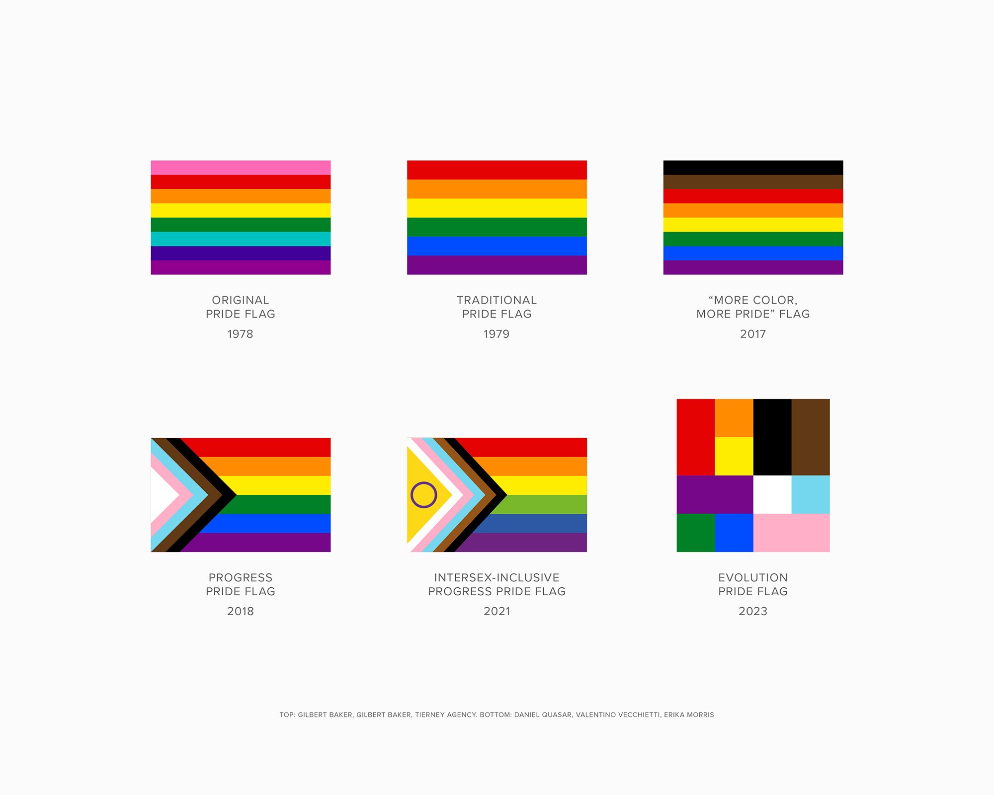
Since 1978, the Pride flag has been the symbol of the LGBTQ+ community worldwide. Partnering with Queer Club, a queer apparel and accessories brand, Morris Design was tasked with creating a new Pride symbol that simplified and reimagined existing flag designs, while celebrating its past, present and future evolution.
-
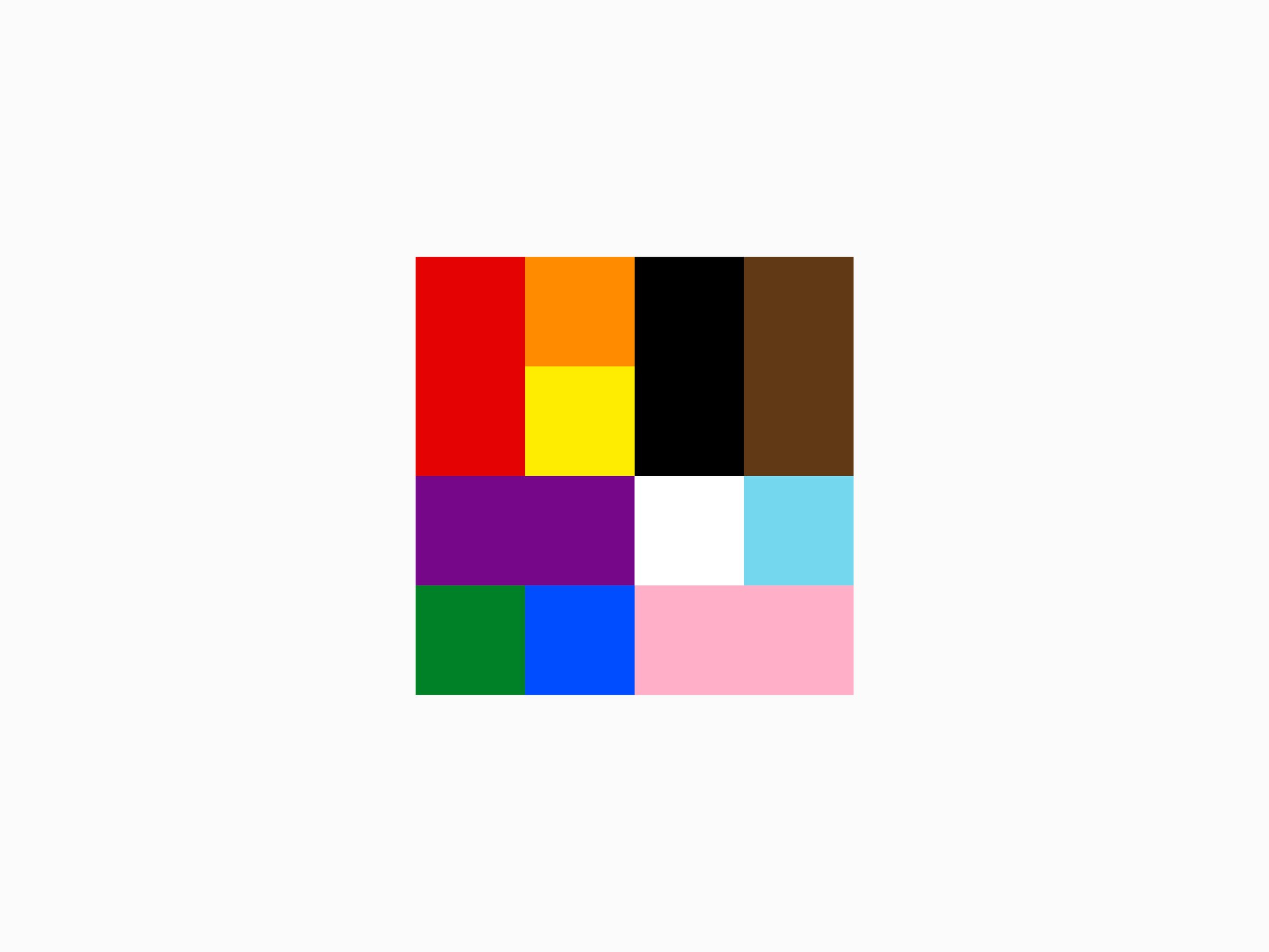
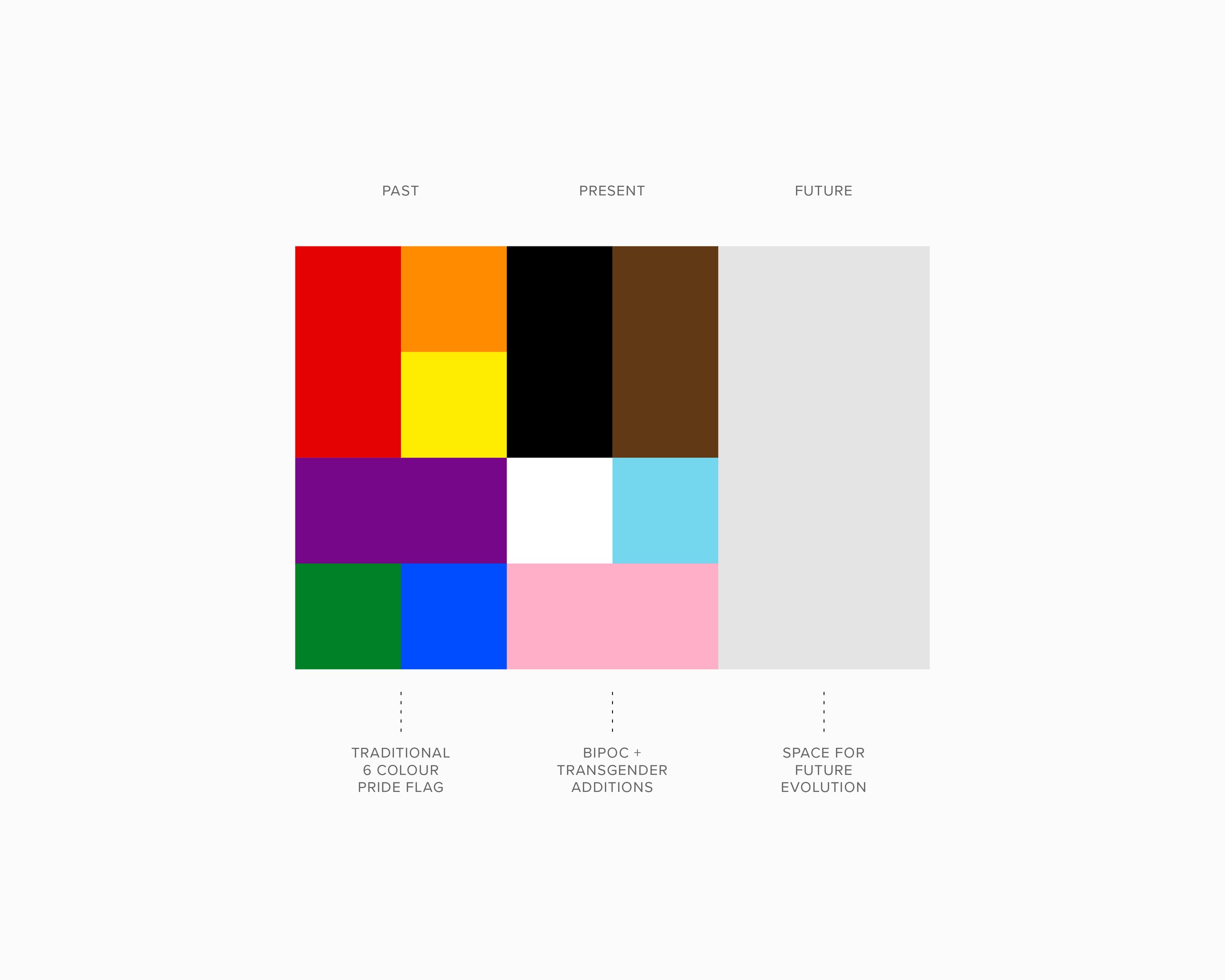
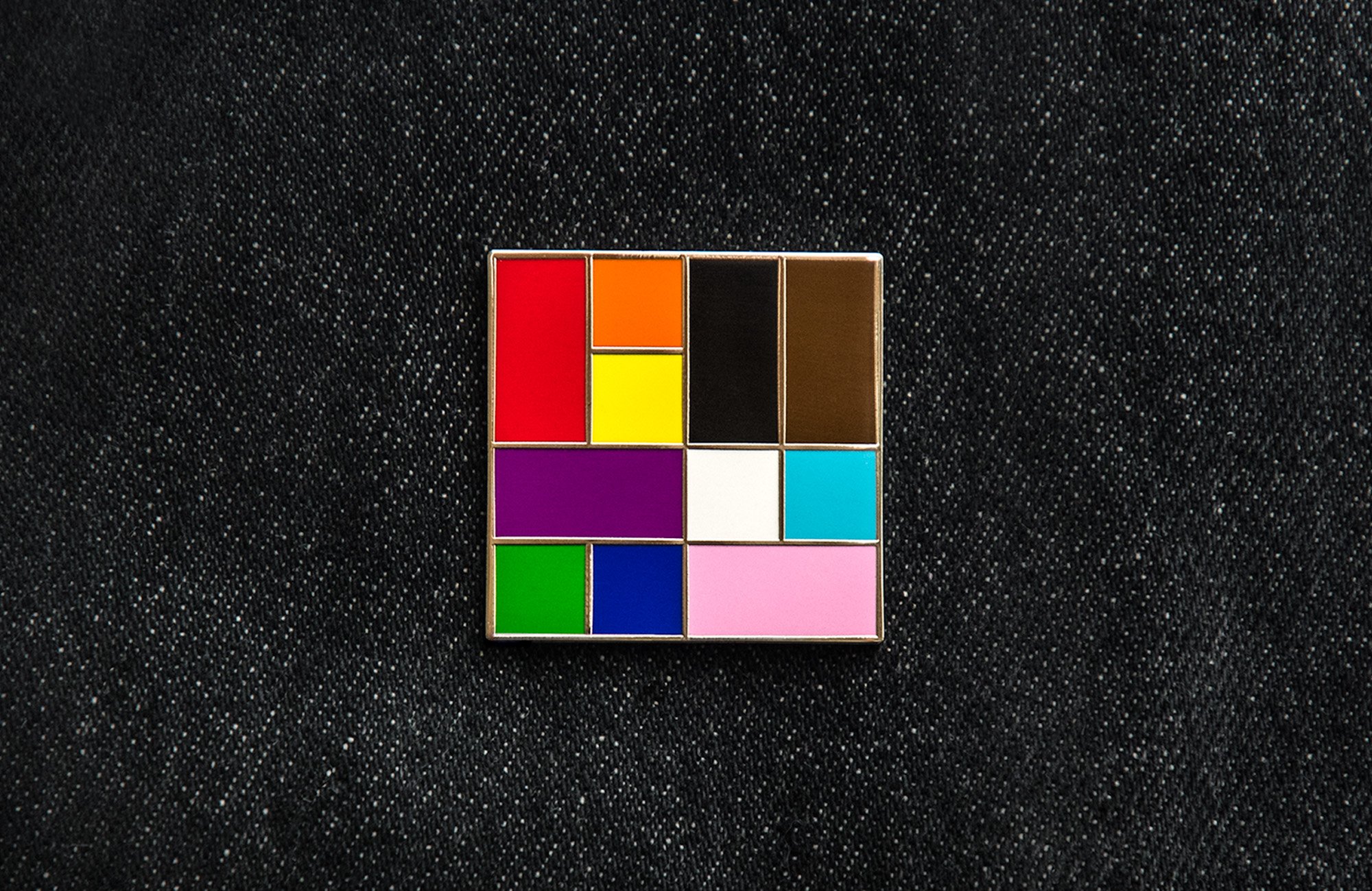
The project was approached as a complete redesign, diverging from the traditional six-colour Pride flag foundation relied upon by earlier versions. The addition of new identities and greater representation was a positive step forward, but had also led to an increasingly complex flag design.
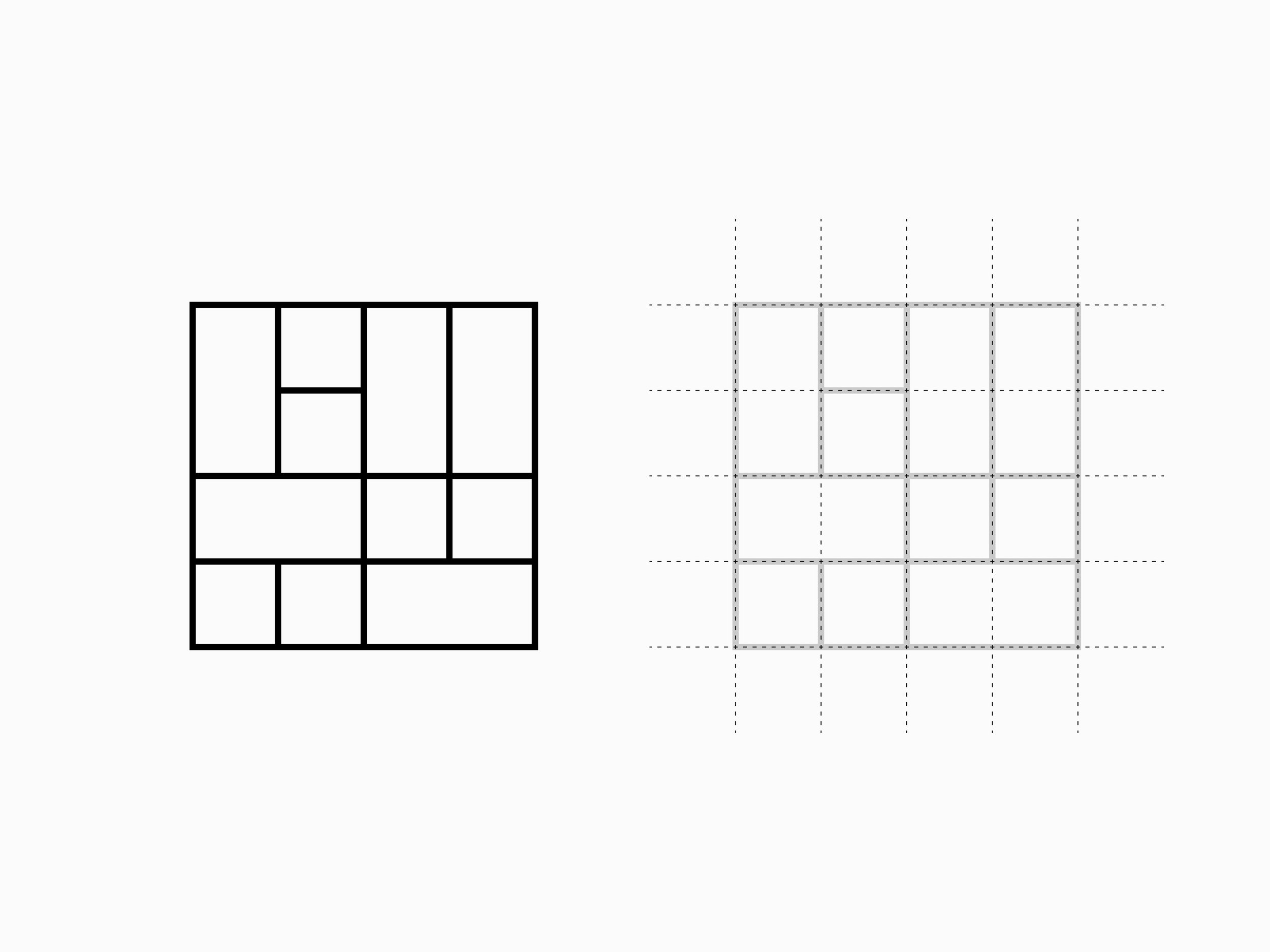
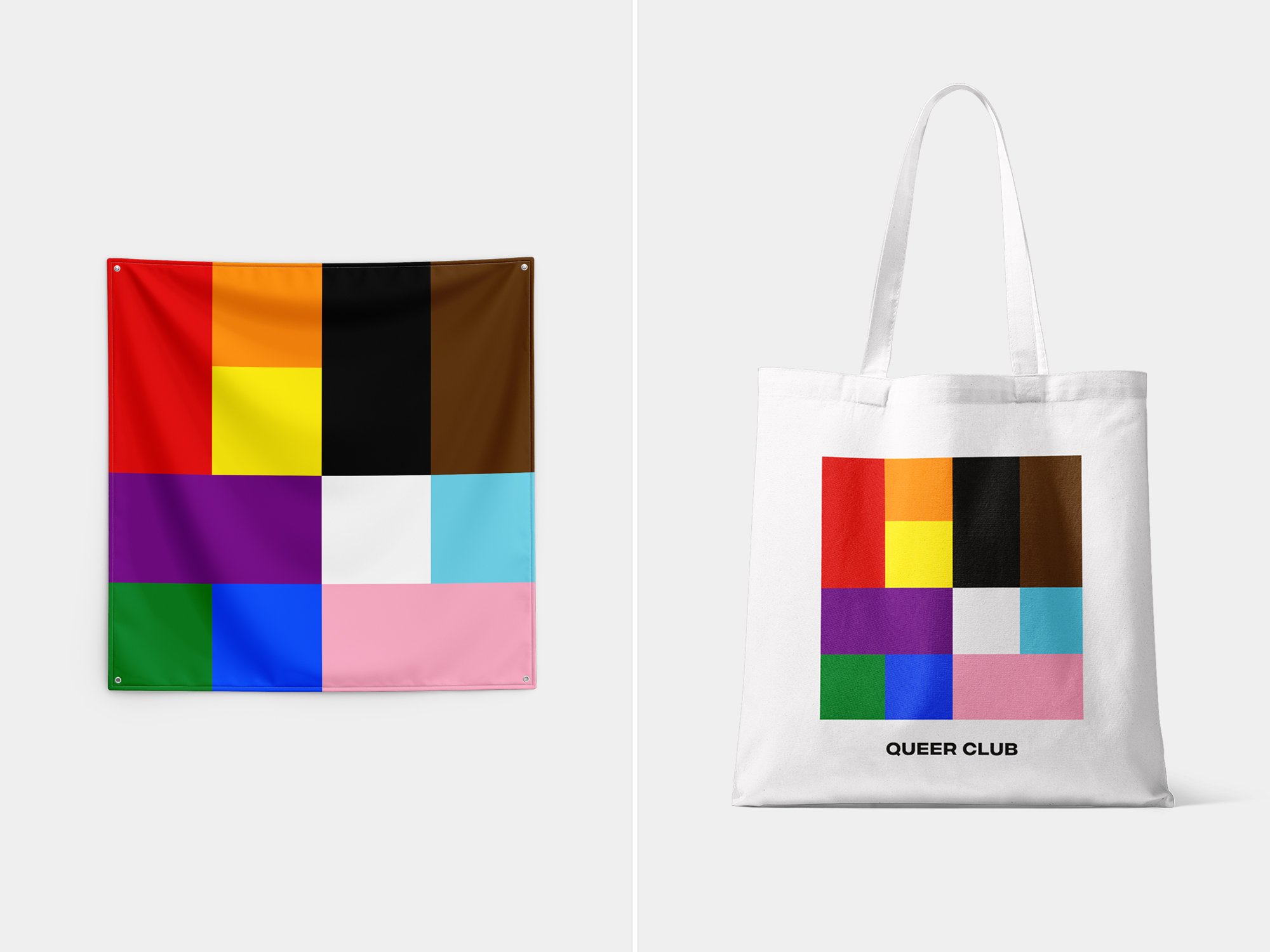
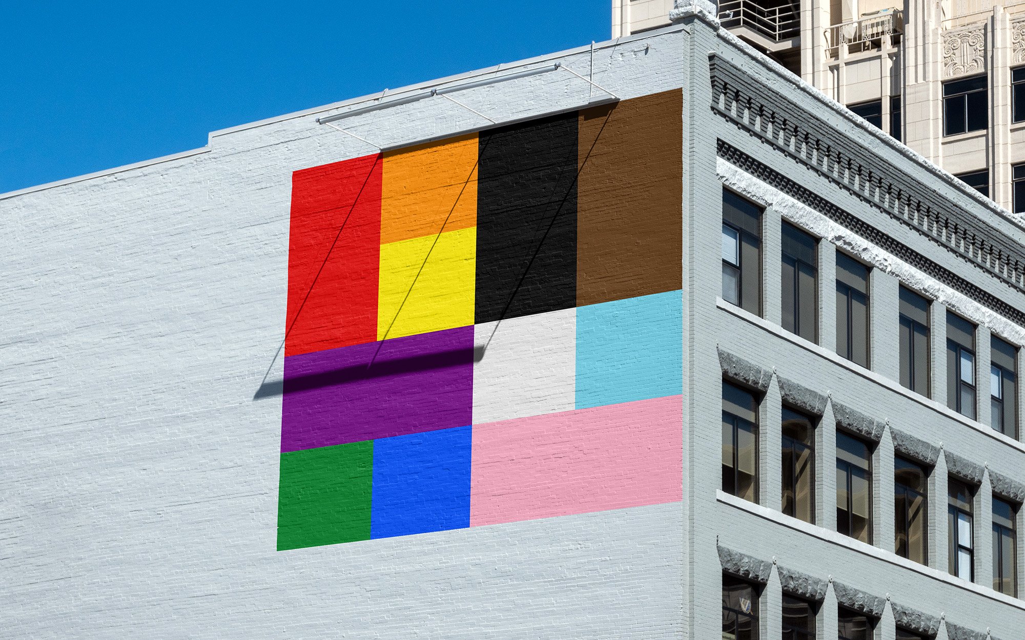
To ensure design consistency, give equal weight to all identities, and differentiate itself from previous flag iterations, a square modular design was created. Coloured blocks symbolizing the traditional Pride flag and the newer BIPOC and Transgender additions were configured in a 50/50 split; ensuring balance, visual harmony, and equal representation. The square shape also allows for future expansion, with space to evolve into a more common rectangular flag shape.
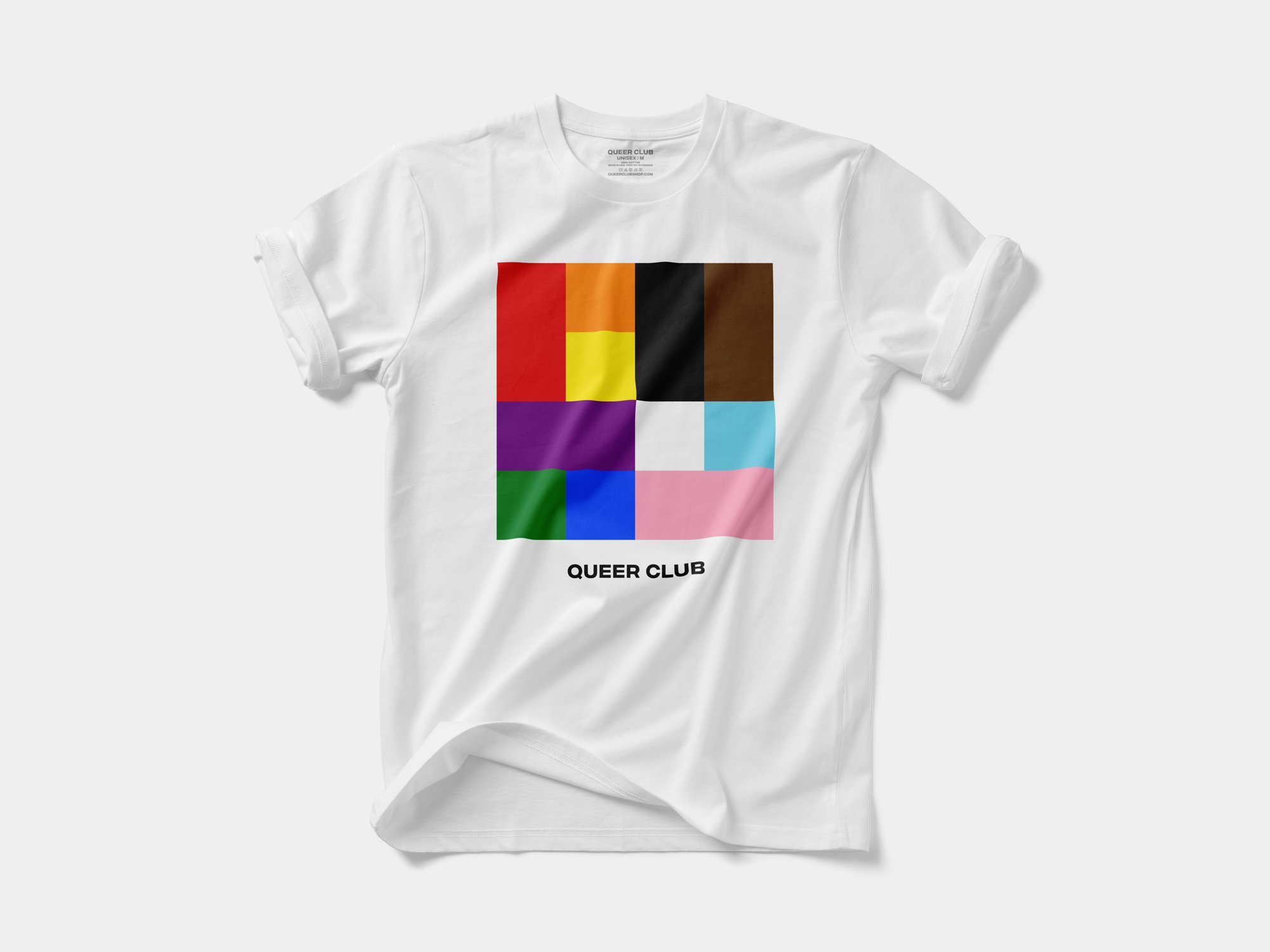
The final design was then used for Queer Club Pride merchandise.
The project was also recognized at the 2024 D&AD Awards, winning a coveted Wood Pencil.
–
–
Scope: Flag, Apparel and Accessory Designs
Client: Queer Club
Awards: D&AD Awards (UK) – 2024 Wood Pencil Winner
(Branding / Micro Enterprise / Logos)